Brand Identity / Illustration / Web Design
Clara
CLARA.SO
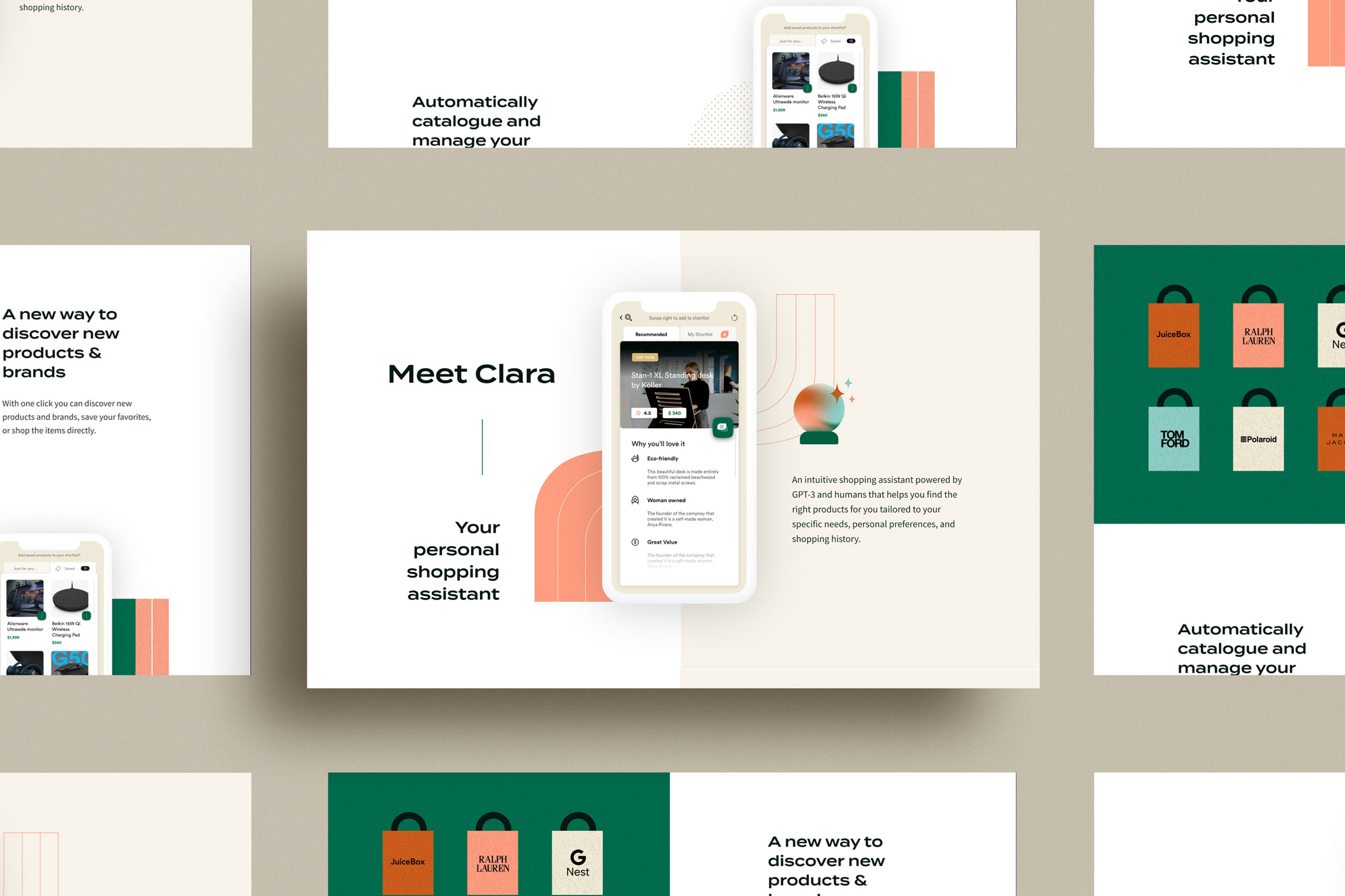
Clara is an intuitive and conversational shopping platform that combines AI and a team of shopping experts. The app helps find the right products tailored to the shopper’s specific needs, personal preferences, and shopping history. The app is still in the early beta stage.
Scope
— Discovery & Strategy
— Logo System
— Typography & Colour
— Illustration
— Web Design
— Brand Guidelines
Target Audience
Clara's people are comprised of high income not yet rich Millenial parents living in the city. They are very busy people and find it overwhelming to find the time to extensively research big purchase items that they want to buy online. They sometimes will make impulse purchases based on Instagram ads. They value family time and don’t want to have to spend hours researching options in their evenings or on weekends, so they are willing to spend extra if it means getting help and saving time.
Select page from the Clara Brand Strategy Document
The Goal
Futuristic yet human, high-end yet personal. Our main goal was to make the branding feel fun and friendly to their target audience, while at the same time representing their higher-end, state-of-the-art product. Everything about the Clara visual branding was crafted with the intention to look very custom and personalized to the brand. A unique colour palette, intricate patterns, and a custom gradient mesh. Custom visuals to reflect Clara's custom experience.
The Logo
We based our logo type on a font called Changa because of it's bold, friendly letters. We were also drawn to the versatile shape inside the lowercase 'a' that can be pulled out for brand pattern usage.
Colour Palette
We came up with a unique colour palette to reflect the personalized experience of the Clara app. Clara gets extremely personal with its users so we couldn't use a generic colour palette. We intentionally moved away from the typical saturated blues and purples that are huge in tech and software design right now to ensure that the palette is unique in its industry. Soothing and slightly rustic over bright and saturated.
Typography
We chose a heading font with wide proportions and a large x-height, which allows it to be set at small sizes and still remain legible, while also working powerfully as a large heading. We paired this strong heading font with a simpler, symmetrical body font to create the perfect balance.
Brand Patterns
Flat, minimalist styles and thoughtfully crafted patterns + backgrounds.
The Website
The Clara founders were landing page content pros: they came from growth marketing management backgrounds, so they handed me a wireframe and made the landing page a breeze to design. We made good use of the beautiful futuristic gradient, fun illustrations and ample white space.
More Work

Logo Gallery
From the archive

AirMason
Branding / Web Design / Animation